Introduction to Shape Language & Silhouette
Shapes are used in design to communicate themes and ideas about the subject or define the general nature of something. Shapes have prescribed meanings that evoke certain emotions and feelings in us whether we’re aware of it or not.
Silhouette is part of understanding shape as a language, but focuses the subject blacked out. This tutorial will show silhouette has been used by iconic figures, and how you can use it to ensure your drawings stand out with more impact!
Shape Language Design
There are different types of shapes used in design, they’re all around us and come in different of sizes!
We seem to be hard wired to associate certain shapes with certain moods, emotions or expectations. Essentially, shapes can suggest positive, negative or neutral feelings.
Here is a classic example from nature that quickly demonstrate the power of shape language…
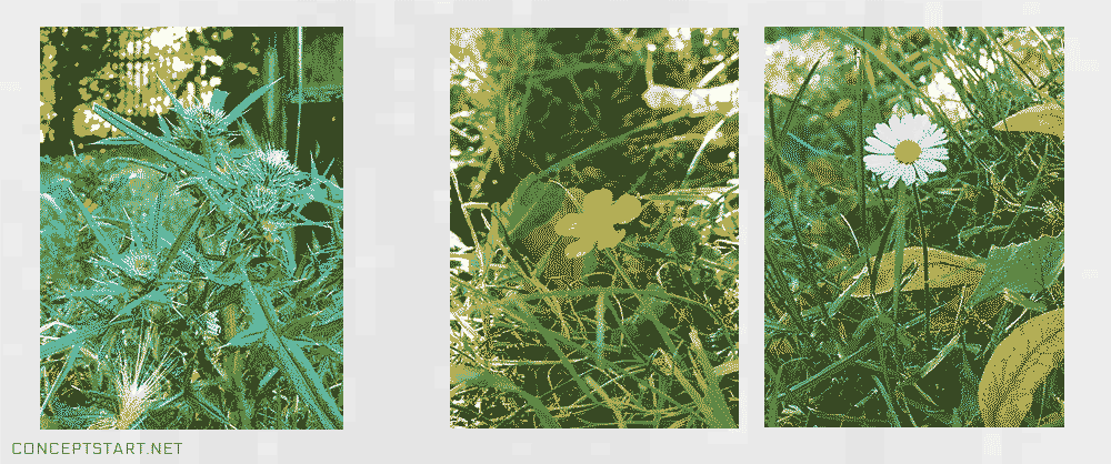
This is a weed, which is typically associated with a negative emotion. If we compare it to some daisies, it seems to be contrasted in terms of the overall shape.
A daisy has positive connotations attached to it. Without even studying the shapes, you get a certain feeling about each one.
So I think that our response to certain shapes are ultimately conditioned by nature, and perhaps past experience. Side by side, you can see a clear difference and know which you’re most likely to stay away from.
Shapes are usually broken down into 3 main categories:
Organic shapes represent things found in nature. They tend to be free-flowing with a variety of shapes from symmetrical to non symmetrical. You can expect Butterflies, bugs and plant life to shapes like clouds and waves that are randomly formed and free.
Geometric shapes are the basic shape that you learn from an early age such as squares, rectangles, circles, triangles and crosses etc. They often have symmetry and a structured look and feel with sharp edges and angles
Abstract shapes are simplified forms distinct from being Organic or Geometric. They’re often a fusion of the two, and they’re abstract in nature because we have intervened. Through design they have had a process of thought behind them.
In design we want to concern ourselves with mostly with Geometric and abstract shapes, because these are shapes we can use for the purpose of design.
Organic shapes are more random, and with design is a very deliberate process, but we can be inspired by them and manipulate organic shapes into our design process to create certain moods or feelings.
Shape Design Psychology
As you know already shapes are made up of lines! And even lines give a certain impression of things…
_ Horizontal - Reset and stability
| Vertical - Height and power
/ Diagonal - Movement, unstable
) Curved - Soft and Safe
> Angles - Chaotic, uneasy, speed
So, let’s see how these convert into shapes and then we can consider what meanings they can convey:
 Circles can represent
Associated words: Soft, Unity, Cute, Power, Innocence
Circles suggests the infinite, unity, and harmony with a sense of movement that contains energy and power. They are less common so work well to attract attention and set things apart. They represent community, integrity, and perfection, planets, wheels, balls, fruits and offer a feeling of well-roundedness and completeness.
 Squares can represent
Associated words: Strong, stable, balanced
Squares and rectangles creates a sense of equality and conformity. The familiar shape can be seen as strong, stable, trusting, orderly, rest, equality and peace. The number four (four corners) is associated with very material things of this world.
 Triangles can represent
Associated words: Movement, power, harmony
Triangles suggest movement, direction and steadiness depending on which way they point, up or down. They can be stable or unstable. Triangles have energy and power and suggest conflict or strength. Other associations can be progression, purpose, hierarchy, law, religion, tension etc.
 Spirals can represent
Associated words: Birth, Death, Creativity, Growth
Spirals are often found in nature and are expressions for creativity. They suggest the process of growth and evolution. Other associations could be fertility, birth and death, the supernatural, transformation and a journey.
 Crosses can represent
Associated words: Balance, Hope, Divinity
Crosses are seen as the cross point of divine energies. They represent the self and the interaction between vertical associations such as height and horizontal associations such rest. They can be used to suggest life and healing, faith, unity, hope, relationships, balance and spirituality.
So these shapes are essentially an alphabet, and when mixed together in different ways they create specific visual words that communicate certain ideas.
Shape Design Case Study
So taking these principles let’s take a look a some images of things that have been intentionally designed with shapes in mind, and we should be able to see the intent behind them.
Madagascar Film
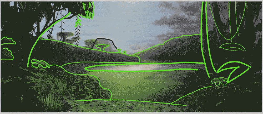
Let’s take the film Madagascar. This scene demonstrates a peaceful setting, fusing soft curved lines with some stable horizontal elements.
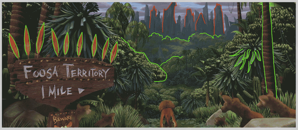
We can begin to see the transition into a more sinister environment. Even the shapes begin to transition with more verticals and subtle points at the end of the shapes. so that you know further down the path will lead to Foosa’s Territory!
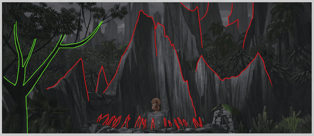
Until finally, the darker place which is described by tall jagged rocks that come to a point as the main shape setup for this image. These rocky mountains suggest a sense of danger and unease, which is completely different to the shape of the mountain seen in the previous image.
This mountain is stable, and almost rectangular. It looks like something you can take refuge on. Which is almost like a polar opposite of the mountains in Foosa’s territory!
Monster House Animation
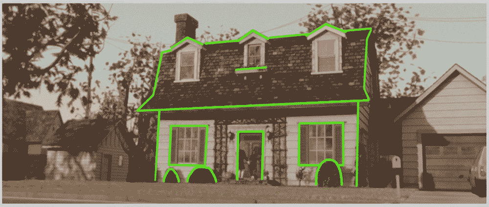
Now moving on to Monster House animation. His first image describes a typical house in the neighbourhood. With the rectangular shapes it suggest security, and there’s a symmetry in the design which also suggests there is harmony in the design. It feels complete.
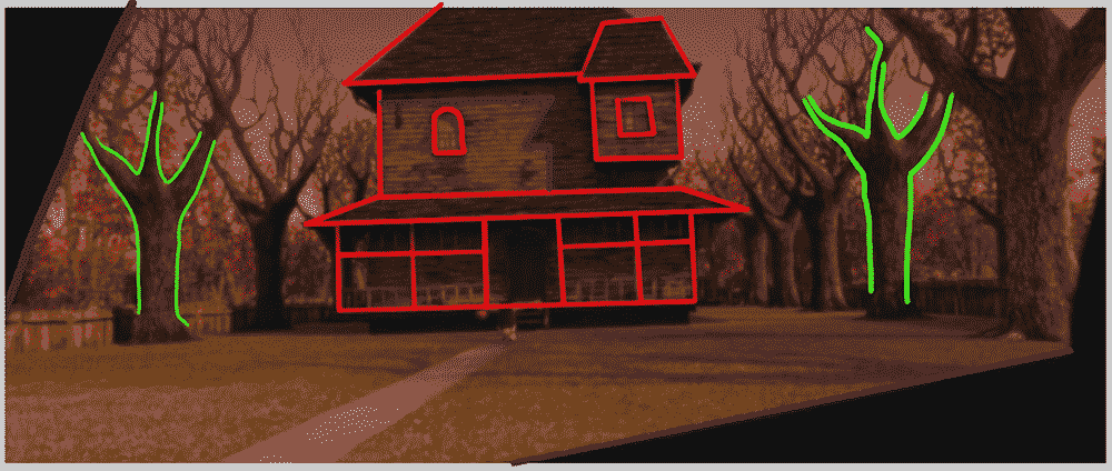
This next image we see the monster house before turning. Something isn’t quite right about it. There is no symmetry, one of the windows looks out of place. It’s very odd looking! We can almost make out a face in it with the mouth and 2 eyes for windows. The diagonal shadows cut into the scene to add more tension. The sharp point hints towards danger. And the trees appear to have no leaves to suggest death. They also appear like mini figures.
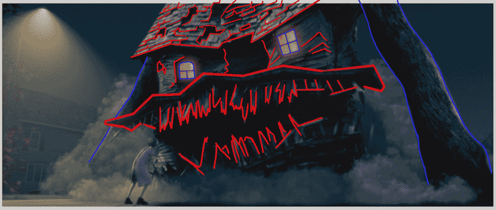
The final image we see how it has turned into the monsor House! The tiles on the roof are jegged with sporadic holes and there are no more horizontal lines to suggest any sense of rest or stability. The sharp jagged teeth, again at diagonals to add more sense of unrest. This evil house is framed by the trees which cut into the scene at an angle, they adds to the overall shape of the house and reduce the feeling of vertical lines. The house is alive through the glowing eyes, and we can notice more so how each eye has a slightly different shape, which again takes away any sense of harmony.
Ants Movie
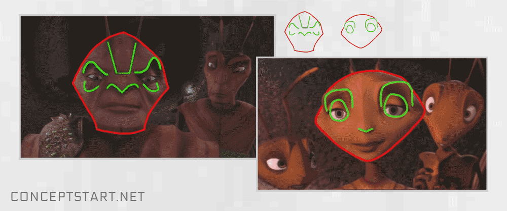
Now let’s see the difference between the antagonist and protagonist character faces in Ants. So who’s the good guys? And who’s the bad guys?
It’s quite obvious. The main bad guy has much harsher features. The eyes are more sunken in, and the shapes are very angular which are enhanced in contrast to his block like chin which is testament to his strength as a character. He’s not completely evil, but he’s very harsh and mean
So now the good guys should be obvious! We have much softer shapes. The eyes have less detail, which makes us feel more relaxed when we look at them. They’re bigger, rounder. And more comforting. You should also notice the differences in colour, which is another tool that can beused to reinforce feelings.
Jungle Book Concept Art
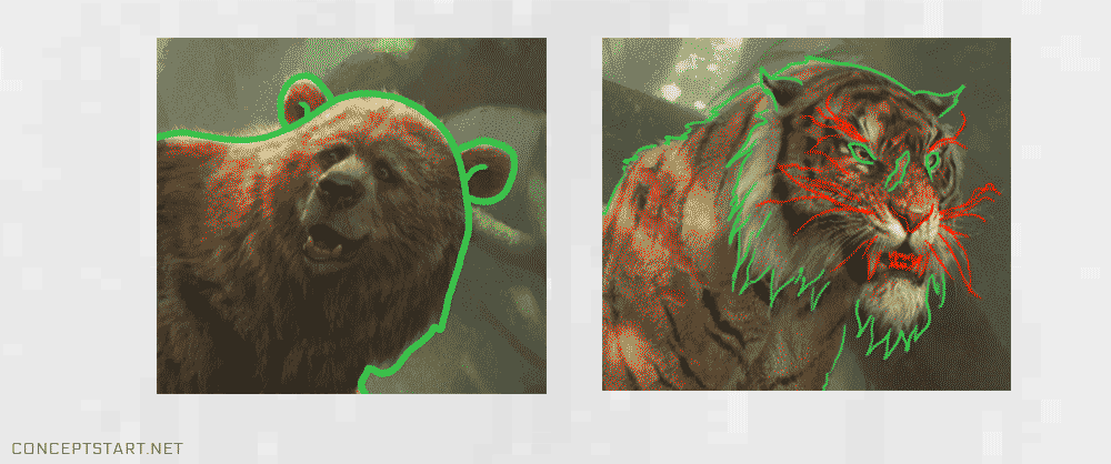
And finally, a look at Jungle Book’s good guys & bad guys. This is some concept art by one of my favorite artists Michael Kutsche. For Baloo the friend bear we have soft and rounded shapes, especially in the face and shere khan has a lot more pointy shapes going on. By nature, the Tiger has jagged stripes which are striking, but he has enhanced them to work with the character type. The hair around his face isn’t completely straight, they waver in part and come to a sharp point. His whiskers are also jagged, which reflects his character. Whisker usually shoot straight out, but these whisker have been through many wars, and you really don’t want to cross him!
Ok so hopefully now you can see how shape language is deliberately used in order to evoke certain moods and emotions.
Whenever we draw, whether its from life or imagination, we should always consider the psychological components and meaning behind these lines and shapes. We should be asking, what is the idea that I want to communicate? What do I want the person looking at this image to feel at the end? Understand shapes language will help you to achieve this.
Using Silhouette in Design
This brings us to Silhouette! By definition a silhouette is:
“The dark shape and outline of someone or something visible in restricted light against a brighter background.”
Ultimately, it’s used in design for quick communication of ideas about something, as as humans we have the ability to pick out the overall shape of something and decide what we feel about it based on the overall shape. So, let’s take a look at these iconic characters.
Iconic Characters with Strong Silhouettes
These characters have stood the test of time in the entertainment industry, from Video games, Cartoons and blockbuster movies!
You should be able to recognise them, or they should at least seem familiar. It’s likely that in some point of your life you’ve been exposed to them. And they seem familiar is because they all have a strong silhouette. They’re simple and original, so they stick in your mind.
Maleficent
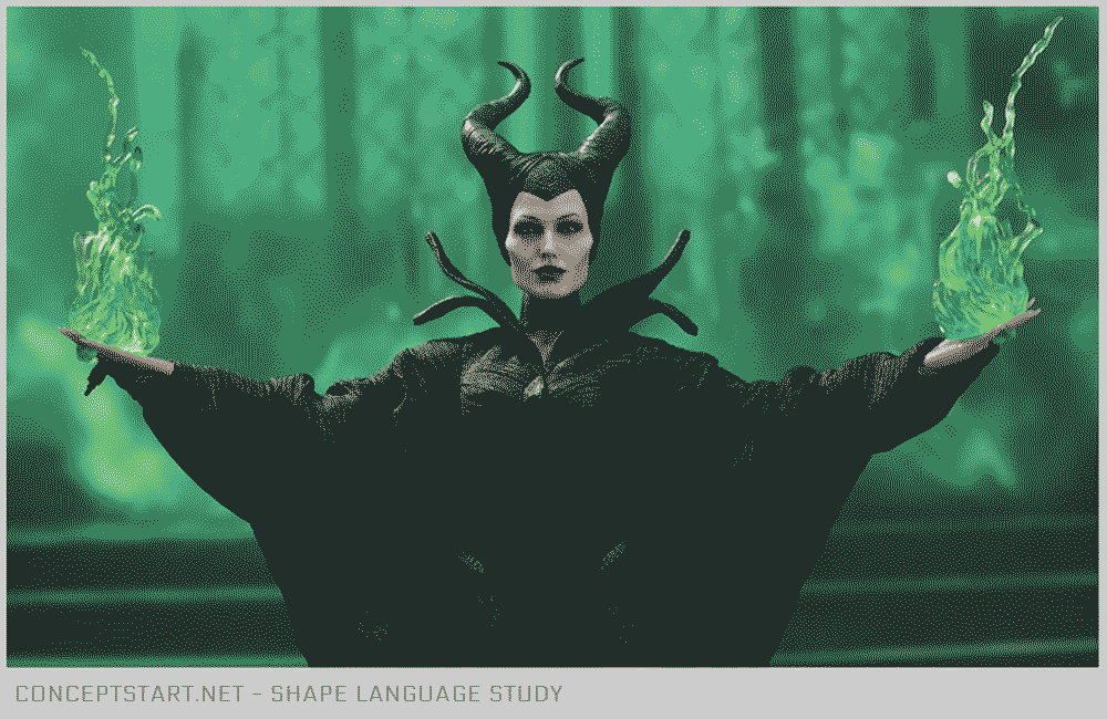
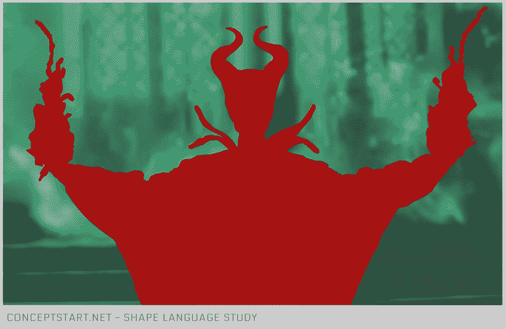
Maleficent is a dark character set in a natural forest environment. The shapes used fortify this as we have the large leaf like shapes around her neck and the twisted horns that suggest a devilish streak. It’s simple but extremely effective.
Characters from Madagascar.
First up, Madagascar. He’s a friendly chap, stable and loyal which shows in the shape language used in his design. A fusion of diagonals for movement and rectangles for stability, rounded off to suggest he has a friendly nature.
Gloria, is a larger than life character! She’s full of rounded curves and comes across as comical. Her feet are very smaller compared to her upper body.
And then we have Melman, he’s a super nice but a little goofy! This is expressed through the use of soft curves and some angular shapes come across a little crooked in places.
Overview of Silhouette
Strong Silhouettes and shape language isn’t just reserved for iconic characters. They can be applied to things assets such a House, a Tree, Clouds, Weapons, vehicles and so on. When it comes to design, essentially everything needs to be treated like a character that serves the overarching narrative or theme.
Here’s Some points to take away with you… Silhouettes should be:
- Clear and readable
- Original & memorable
- Convey feelings and emotion
- And Potentially exaggerated
Example of Shape & Silhouette Design Process
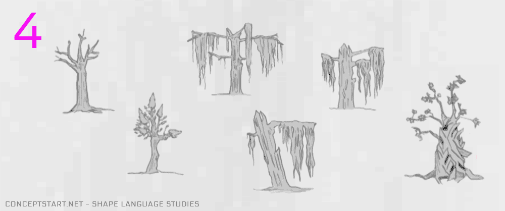
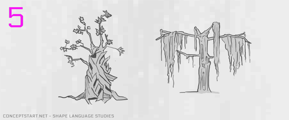
Evil Tree Demo
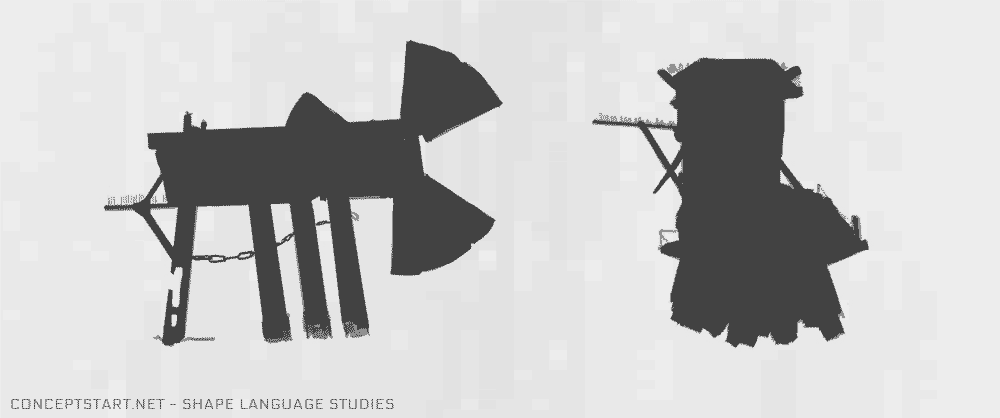
We can approach these tasks from different angles, this first option we will start with the emotional task route! And from this try to design something using shapes that will help us to portray a specific feeling.
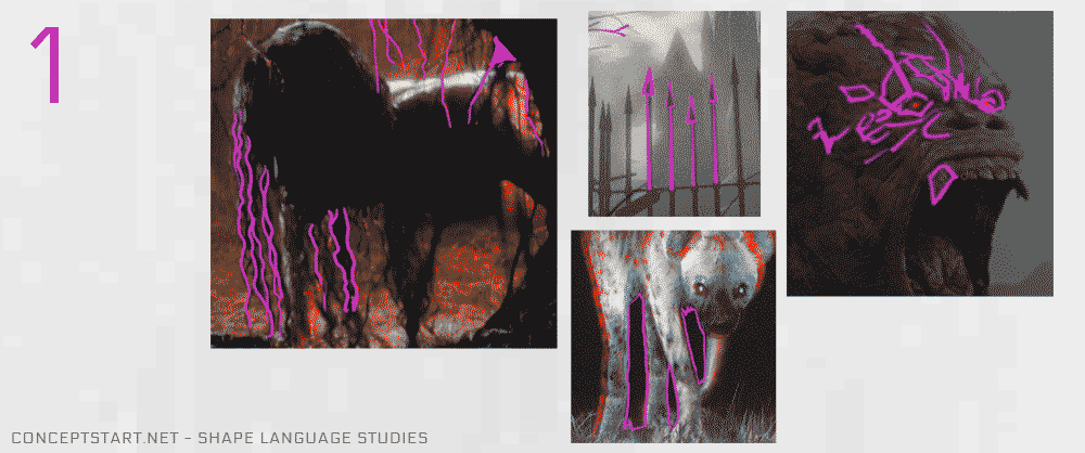
So starting out with the emotional route first, Shape X Task Generator. Above is a demonstration of shape language & silhouette, I generated a task that required me to design an Evil tree! The design process starts by generating a moodboard, or finding pre existing images of things that come across as evil.
You can begin to draw over the images, tracing some of the lines and shapes across a variety of sources, this will enable you to explore a more diverse range of shapes ideas. Once you’re happy with the shapes you pulled out from the reference, separate and spread them out. Make sure you have references for ALL keywords in play, so for me it was House and Evil; both are crucial to the design.
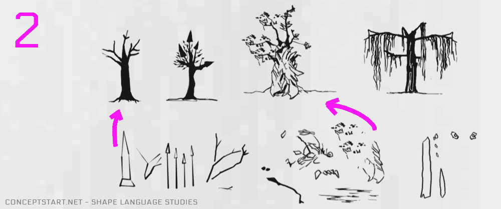
Here I begin to explore some new shapes, by fusing the shapes discover in the mood board. We can play with the shapes, push and pull them, distort them, stretch them and so on, all the time bearing in mind the shape psychology we learned. After I have my base sketches down I begin to refine them and add in more design elements, with more refined shape language.
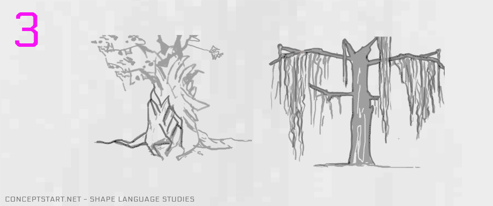
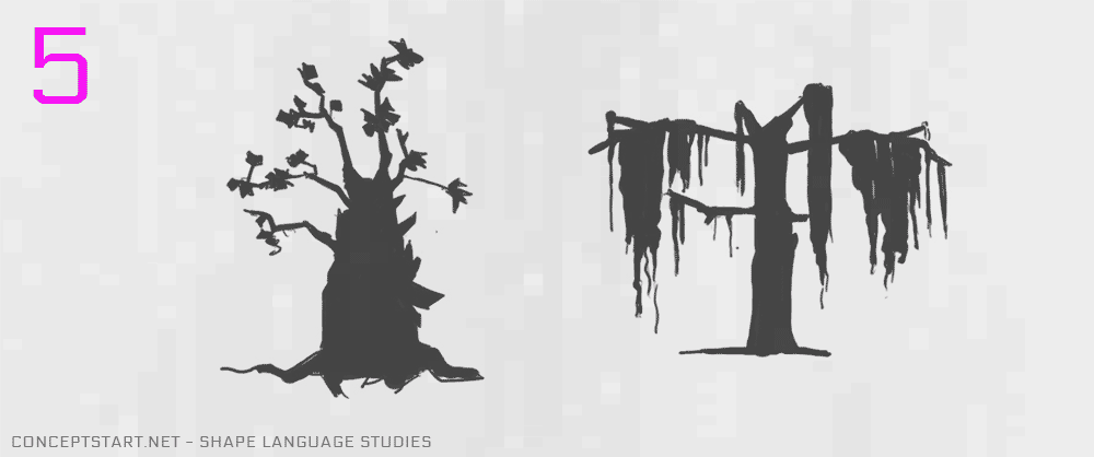
The idea of Evil Tree needs to communicate through the line art of shapes AND the silhouette, I view them separately and decide on my favourite. The ones that have a tick for both states is my winner.
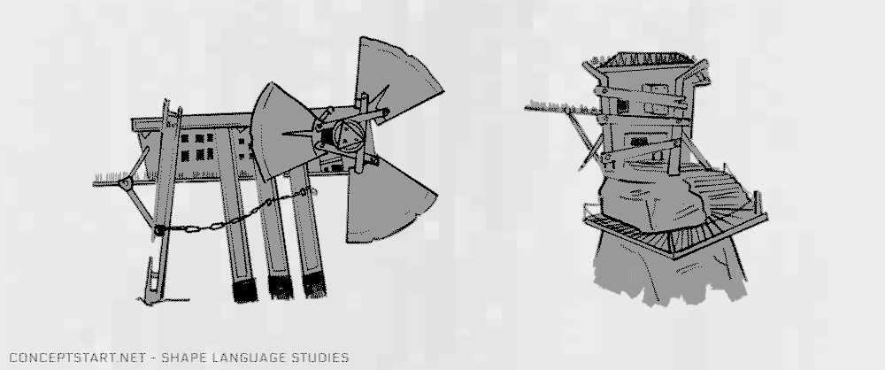
Dangerous House Demo
Following the same process of finding images to influence my shape design. This task was a Dangerous House! Sometimes when you check the overall design in silhouette form, you can get a better sense if it reads as dangerous or not, and you can tweak it accordingly.
I chose these houses to be the best of the bunch because they seemed the most original and felt more dangerous overall.
Designing with Shapes First
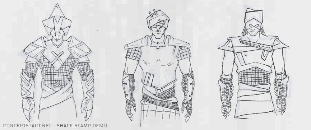
So this tasks was from SHAPE Y Task Generator. The purpose of these tasks are to explore the shapes first and then determine what mood and feelings the design suggests. Through this process of experimentation, you can learn for yourself various shape language & design elements that can communicate certan emotions.
I was prompted to explore Diagonal Line sand Cross Shapes when designing Armour!
When fusings these shapes and lines into my designs, I find the results generally suggest a feeling of strength, dynamic. They also seem somewhat ambiguous in terms of being good or bad.
Shape Stamp Demo
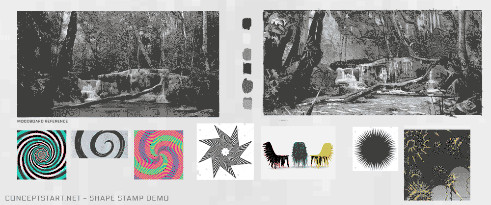
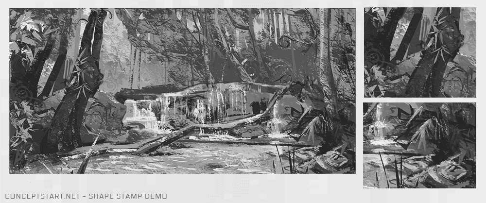
And the third generator is the Shape Stamp Task Generator. This is where we take existing images, or scenes to study from and loosely copy the composition and elements in the scene; then recreate it by tweaking the shapes and elements so they convey a different feeling. In this example I’ll be using spikes and spirals to influence the overall design. To help me achieve this I used the lasso tool, with a texture brush.
It’s a good practice to use grayscale only, this forces you to focus solely on the lights, darks and shapes.
As artists we have a creative license to entertain. So long as we can make the viewer feel something, they’ll accept what we present to them even if it’s not quite lifelike, so long it's rooted in reality enough for people to relate.. but pushed enough to pack it with substance, meaning and magic.
It’s one thing to create pretty images but we can go beyond that and manipulate the shapes to create different moods and feelings.
Now, if we compare the two versions, you should see that mine has a slightly different feel to it. It’s somewhat surreal with the use of curly branches, and a sense of unease with the spiked leaves and sharp angular lines throughout.
Conclusion
Hopefully after reading this you get a good understanding of how intentional you can be by communicating your ideas through Shapes Design and Silhouette.
Drawing and being creative is an act of expression, and we want to be expressive so we need to speak louder than nature intended! Shapes can really help push the meaning and define the subject which helps the storytelling process. Shapes design creates clear boundaries for what things essenially represent.
Silhouette can will help reinforce the feeling and ideas of the being conveyed. Remember to be intentional with your drawings, your strokes and your ideas.
Next Steps to Improvement...
Practice designing things with shape language in mind!
Shape design is a series of conscious and deliberate choices which lead to a final design or drawing that communicates something specific.
The Shape Language Design Generator is created to help condition you to focus on designing specific items e.g a Tree, A house, A book, Clouds and more with specific task from different perspectives!
It essentially prompts you with art based learning tasks, all of which revolved around the key principles outlined in this Art Tutorial Video. It’ll suggest things to design, shapes and emotions to explore and various scenes and more. These tasks will condition you to think and design with intent, so that when it comes to designing your own ideas you will have the experience and understanding of how to effectively communicate them through shape language and silhouette!
When approaching shape design & silhouette, you should be mindful of:
- The pyschology of shapes
- Existing design associations
- Original designs
- Clear and Readable silhouettes
DRAWING TASKS  |
 PREV. TUTORIAL NEXT TUTORIAL PREV. TUTORIAL NEXT TUTORIAL  |
![]() Video Tutorials
Video Tutorials ![]() Task Generators
Task Generators
 Information Information |
GET CRASH COURSE |


